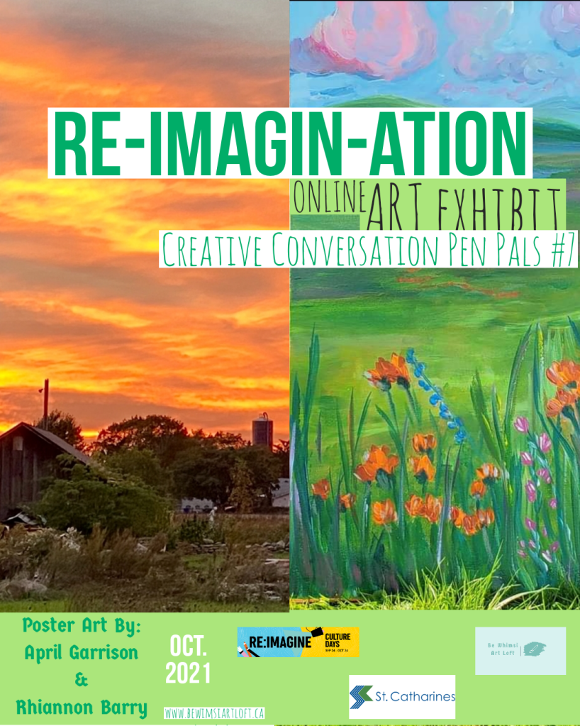
Showcasing the creations made during CREATIVE CONVERSATIONS Pen Pals Project Session #7 ~ From Sept. 25th to Oct. 16th, 2021.
This is an ONTARIO CULTURE DAYS 2021 online event, funded in part by the City of St.Catharines Cultural Investment Program.
Creatives participants were matched in a back-and–forth creative expression for two weeks. The prompt for this Round was ‘Re-Imagination,’ and all interpretations of this & anything in-between.
With only 48 to 72 hours as the turnaround goal for each piece, Creatives challenged themselves to create in a quick timeframe using their Match’s piece for inspiration.
The Creative Pen Pal journey reveals much more than artistic pieces alone ~ This experience can be a tool for self-reflection. Shared experiences and friendships blossom along the way. Like connecting with a great piece of art, connecting with a new person can be daring, frustrating, surprising, comforting, and awakening.
For all Creatives and Artists at any stage in their careers or practices, this project serves as an exciting chance to develop and expand in their artistic discipline or to try a new medium.
Taking part in an online social activity group has many benefits, including increased well-being and social connections.
For many, it’s an exercise in personal growth ~ trusting strangers to contribute to a shared goal. Something beautiful begins to grow as the creative conversation takes on a life of its own and a new unspoken understanding and connection emerges.
All this culminates in a linear exhibit showcasing each unique conversation followed by an artist group chat over zoom. Creatives are encouraged to discuss their emotions and inspirations for each piece and their creative process. We share tips and advice about all things creative.
Please send us a message to learn how to get involved.
Enjoy the exhibit.
Sincerely,
Rhiannon Barry, Project Coordinator
Sign up for the Be Whimsi Newsletter
If you enjoy the experience, please consider donating to help fund the continued delivery of social art-based therapeutic rec programs and services.
Contact: Artbyrhiannonbarry@gmail.ca
A Be Whimsi Art Loft Creation, co-creator of The Creative Wellness Haven Art & Wellness Retreats.
Mirta Ormazabal (Oakville, ON) & Kate Eybel
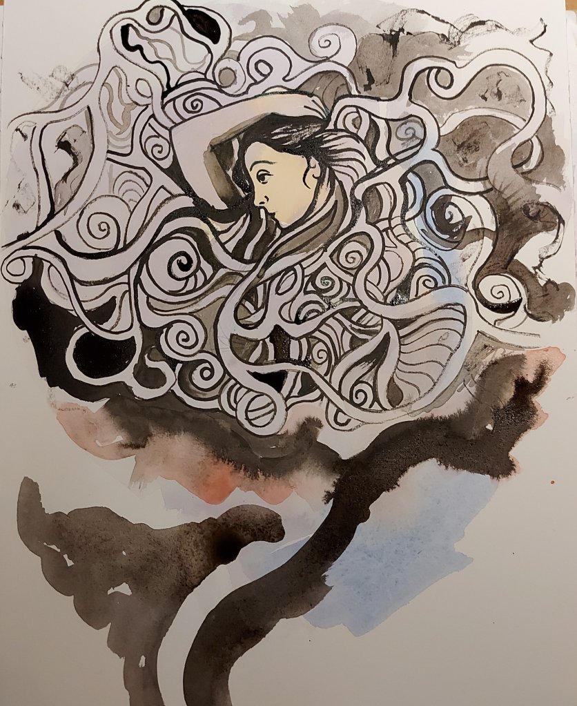
I was Inspired by “The Garden Of Forking Paths” A short story written by
Jorge Luis Borges I loved the idea of drawing a labyrinth and somebody
trying to re-imagine themselves, to figure out what path should they
take, with so many options. There are multiple universes created when
there is a decision to make, and all options are possible in the
multiple universes. So here is my labyrinth
India ink on watercolour paper
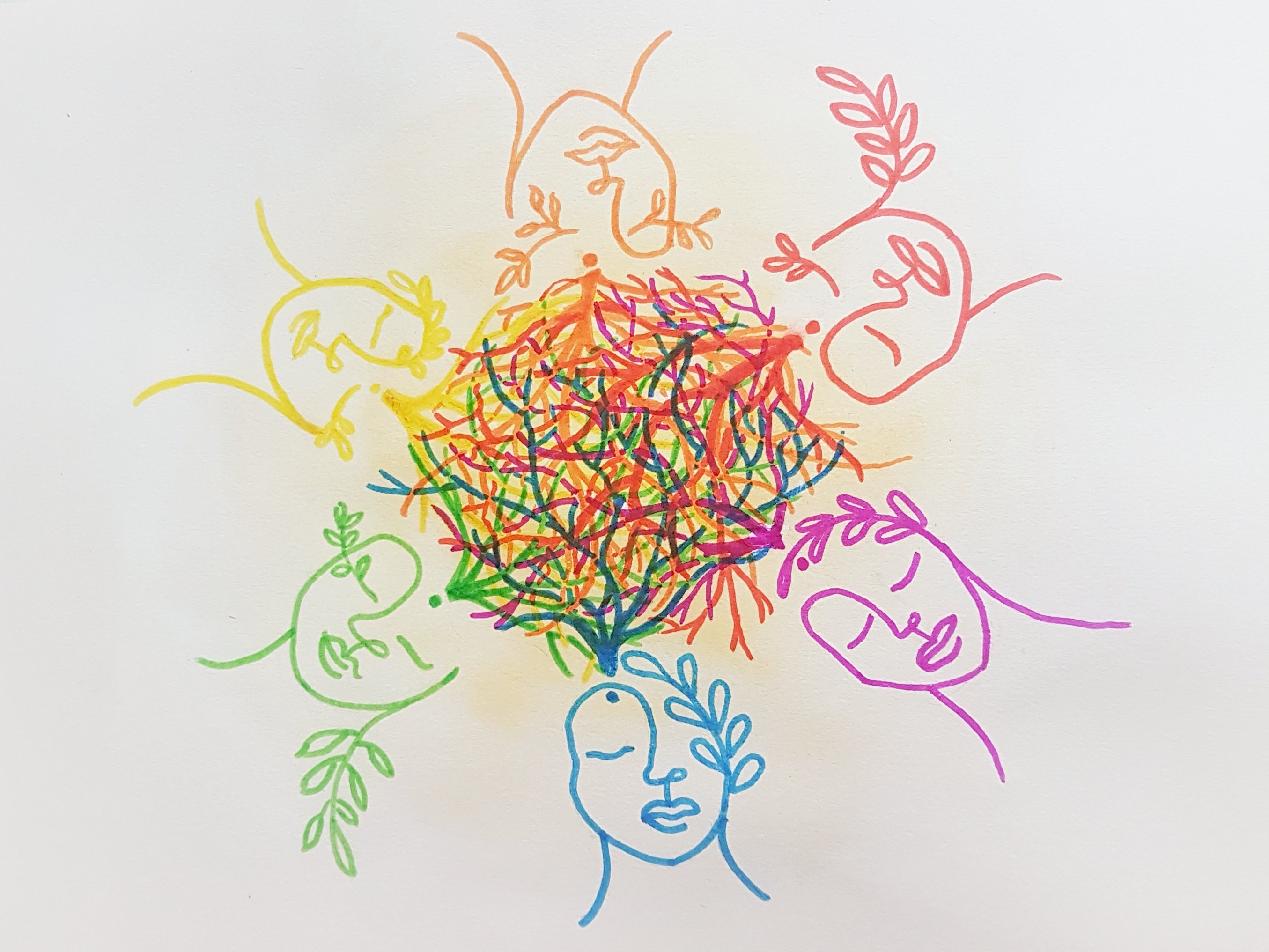
I loved way my partner illustrated an individual’s “many forking paths”
I wanted to expand on that to show how each of our paths intersect and
entwine with others. The choices we make in our labyrinth of life bring
us to moments and places where we meet people who happen to have been
brought there by the choices they too made and the paths they followed
in thier own life’s labyrinth. Some of those paths never meet again and some intersect so often it would be impossible to live a life without meeting those people down one path or another. Like those people you feel like you know from “another life”, soul mates, twin flames etc.
With each re-imagining there are people who’s paths cross our own and
who can influence the future paths we choose. The people we encounter in our labyrinth of life bring “colour” to our travels.
Watercolour, and alcohol markers on watercolour paper

For my piece, I thought in our connection to nature. We are connected to
our world, we inhabit it and don’t appreciate it enough. We live in a
precious world with all it’s precious creatures living with us: plant,
animals, the mineral world. Nature nurture us. This painting started
with the woman in the center and I followed the flow to paint a circle
(circle of life?), with roots and branches entwined, forming the
labyrinth. Now I see the circle looks like a womb, that was not planned.
In response, I thought about the next step outward from ourselves. We have explored the connections of the self, with others and with the
planet, so it seemed natural that the next piece should explore our
connection to the universe. This is something that actually brings me a
lot of peace, it puts things in perspective and reminds me to appreciate
the human experience. We are hurtling through space, on a rock. Either
created by some divine being or the product of the most incredible,
unfathomable string of evolutionary events, or both! Whatever the case,
we are amazing creatures, carbon made conscious. We are literally made
of star dust, and for an infinitesimally tiny blip of time we have the
privilege to experience existence, To perceive the world around us, to
ride emotions from the highest highs to the lowest lows, and to gaze up
in awe at the majesty and wonder of the cosmos.
Watercolour, pencil crayon, silver paint pen, and fineliner on
watercolour paper.
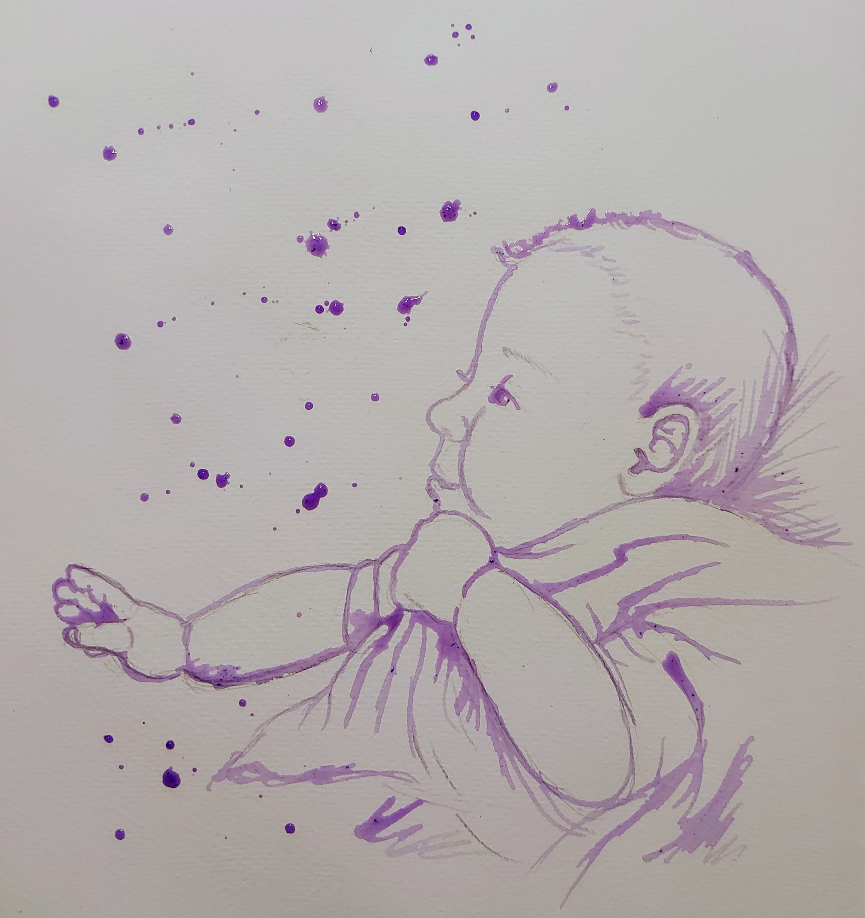
My response is going back to the beginning, every child is a new hope, a
whole future opens and their curiosity is immense. So this is my
painting of a baby looking up to a promising future.
Diluted violet ink painting with a stick on watercolour paper.
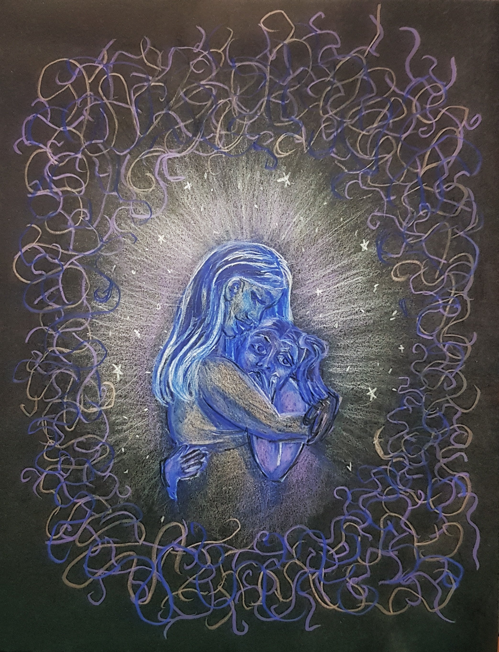
In my final piece I wanted to turn towards this inner child as the last piece in our conversation of reimagination. I think most of us come to a
point in our lives where we feel like we’ve taken a wrong turn. We feel
lost and disconnected we search everywhere for ways to “fill the void”.
Perhaps in our search to feel whole we need to recognize that we already
are. We hold within us this light of hope and potential and unbridled
curiosity. The key is to find that lost child and guide her out of the
shadows so she can illuminate our path. By embracing our childlike
wonder along with the wisdom we’ve earned by wandering down life’s paths and by acknowledging our connection to the people, world and cosmos beyond we ARE whole. The journey to reimagine ourselves might be more of a journey of rediscovering these pieces and choosing to live in harmony with them all.
Susan Robinson (Hamiton, ON) & Carly Davidson (St.Catharines, ON)
12”x16” Acrylic/mixed media on canvas board, $90 (shipping not included)
Since the pandemic began, my measurement of time feels slower now. I’ve spent countless hours in nature, at the waterfront, parks and trails. I’ve noticed the trees, plants and change in the seasons more closely now than in the past. My neighbour has been slowly creating a beautiful garden where once there was only an empty, muddy patch. I’ve been inspired watching its evolution.
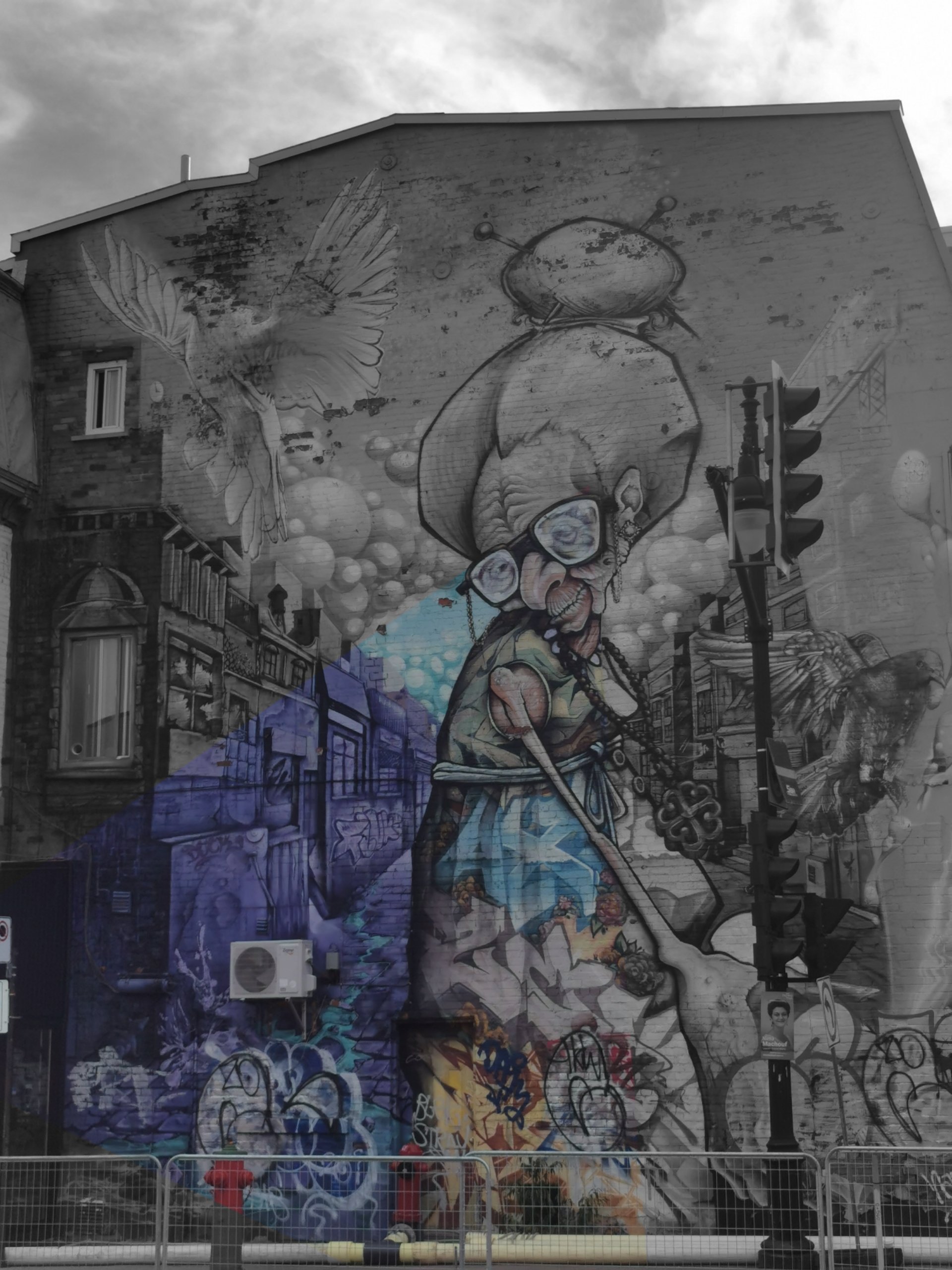
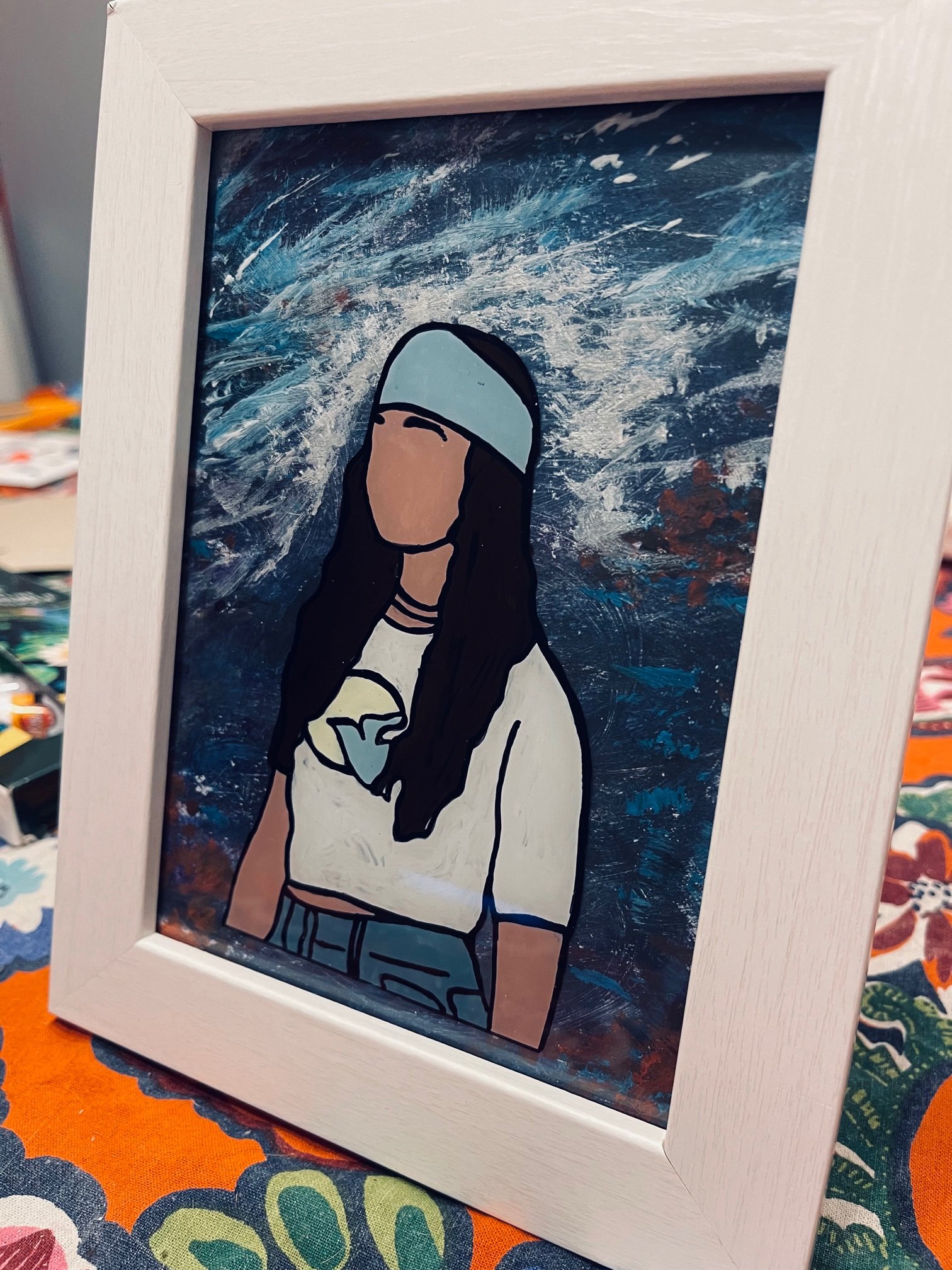
For my piece I chose to go with photography. I saw this mural in Montreal and absolutely loved it. I thought the image itself captured the theme ‘ imagination’ while at the same time the conversion of a plain brick wall into a beautiful art piece represented the theme of reimagine. In post editing, I drained the colour from the photo except for where the womans eyes are looking to further represent how she brought brightness into the world just by being there.
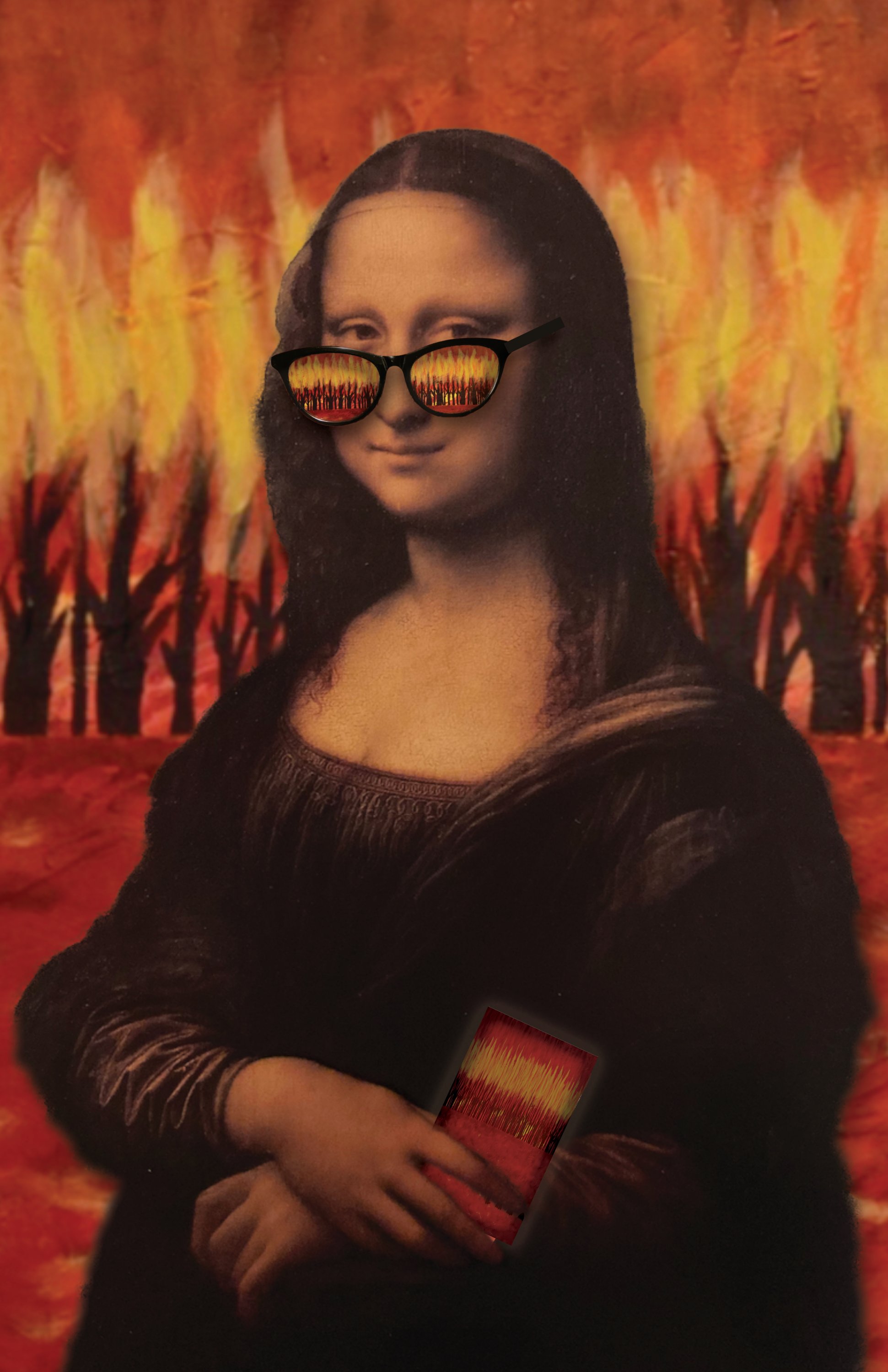
“Modern Mona”
Digital collage, 10”x13” $60 unframed print
(shipping not included)
I responded to my pen pal’s photograph of a mural by taking the eyeglasses as inspiration. I took digital photos of my framed Mona Lisa print, sunglasses and cell phone and combined them with images from an acrylic painting I created previously. The result is a reimagining of the subject of a classic portrait looking at the modern age through new lenses.

” Sound of Colour “
“Music gives a soul to the universe, wings to the mind, flight to the imagination and life to everything.” —Plato
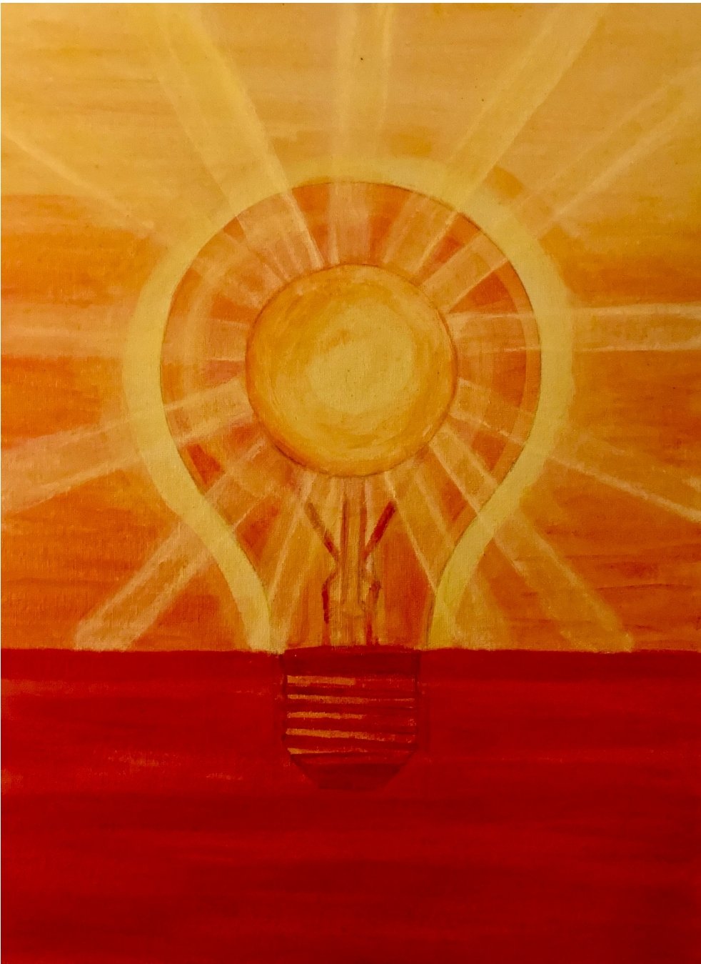
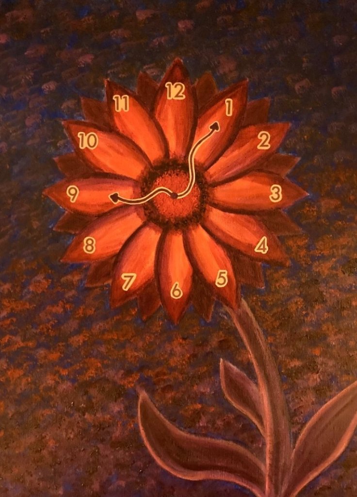
“Bright Idea”
12”x16” Acrylic on canvas board, $90
(shipping not included)
My pen pal’s photograph inspired me to create some “energy” for her musical accoutrements. I liked the use of bright colours that enhanced the photo and wanted to create something with vivid colours. I imagined several different energy sources and inc
operated them into my painting.
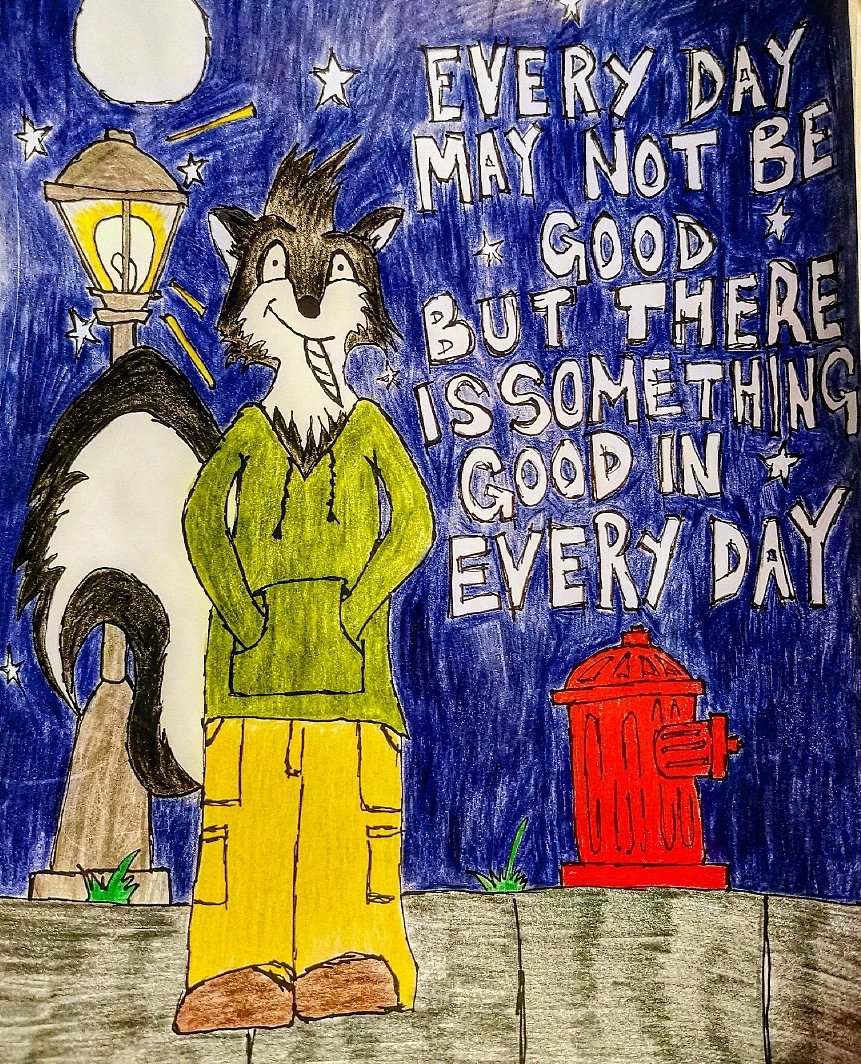
Your bright idea inspired me to reimagine a skunk, putting some ‘light’ on a dark situation.
I used pencil crayons and a thin permanent ink pen.
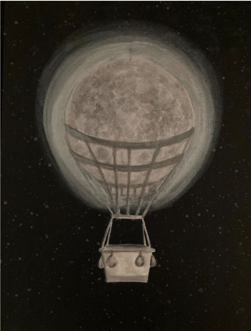
“Moon Balloon”
12”x16” Acrylic on canvas board, $90
(shipping not included)
I was inspired to incorporate the moon from my pen pal’s illustration into my next artwork. Reimagining the moon was a fun exercise. There are so many possibilities. I decided to also use my previous painting as an inspiration for the general sizing and composition of this new painting.
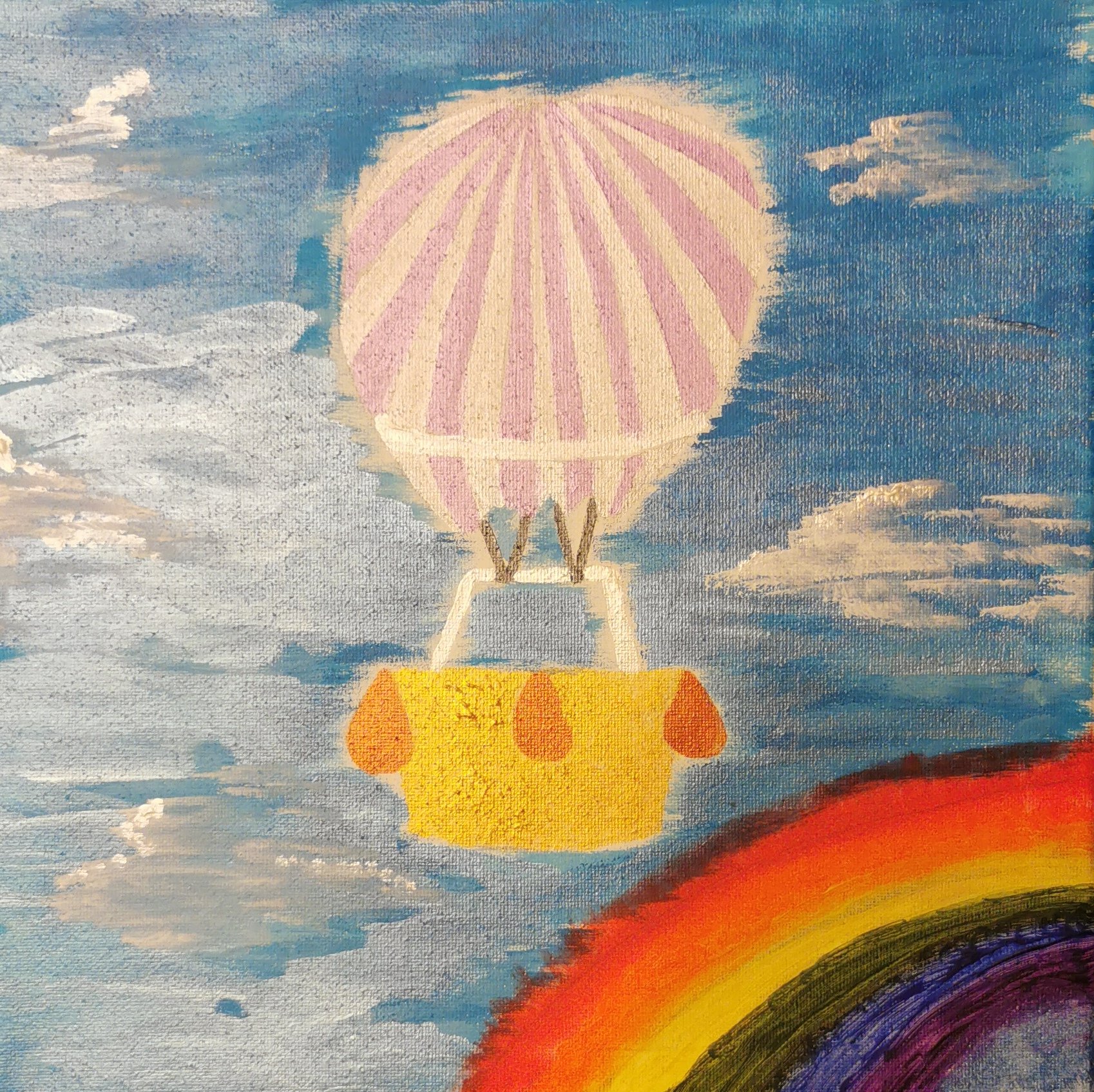
8- C. Davidson – “Over The Rainbow”
Your hot air balloon inspired me to paint my own. It’ll go somewhere over the rainbow 🌈.
Stacy Somerville (Amherstburg, ON) & Ruby Kirwin & Dianne Wright-Kirwin (St.Catharines, ON)
I was inspired by the theme of Re-imagine-ation to play. Around the same time as this creative conversation started, I participated in a workshop in which we were encouraged to imagine possibility and to create fearlessly, like our 3 year old self would. I glued some tissue packing paper to a canvas, and started to paint.
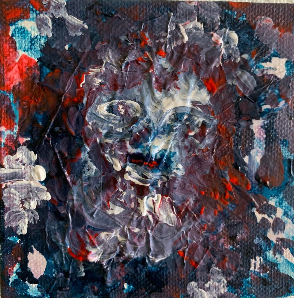
In the first piece created by our partner, we interpreted a full exploration of imagination, possibilities and channeling your inner child. What first stood out to us was the face trying to peer through the swirls of colour. Ruby felt the inky blue and red added a dark, scary element.
Our response was a collaboration where Ruby painted on glass one of her current favourite characters from OBX and I worked on the background trying to create a dark, swirly background inspired by Re-imagine-ation with illumination around the character on glass. The faceless, bold stature illuminated from the dark was an attempt at creating an Im not afraid of the dark, I am Fearless.
Using acrylics and marker.
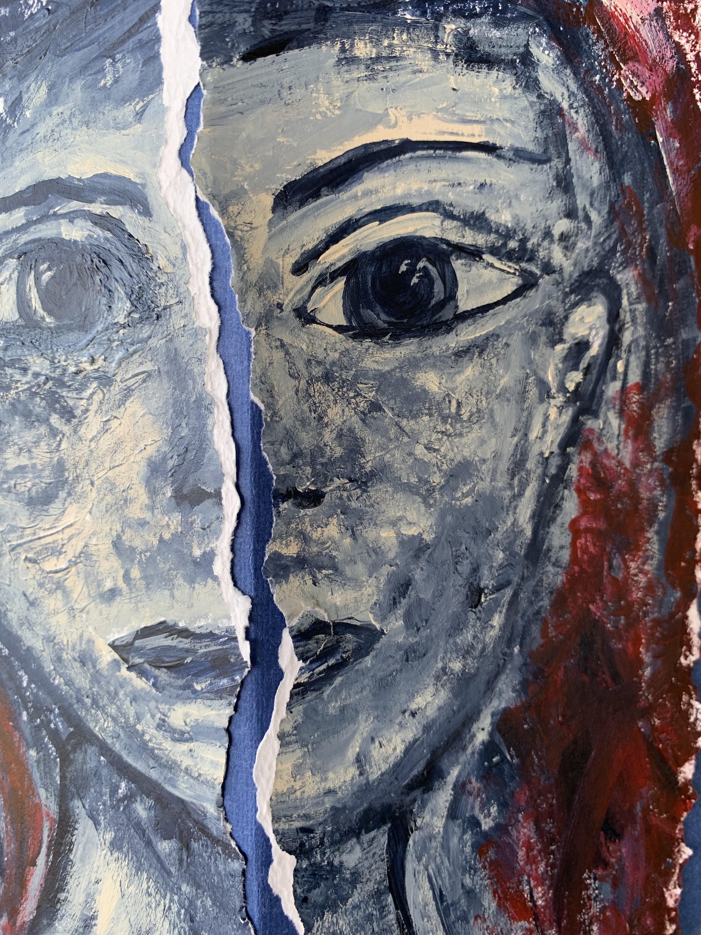
The message of my partners’ piece of being fearless spoke to me, and this is what I had in mind when I worked on my painting. I did some tearing of the paper, and was hoping to create a sense of movement in it.
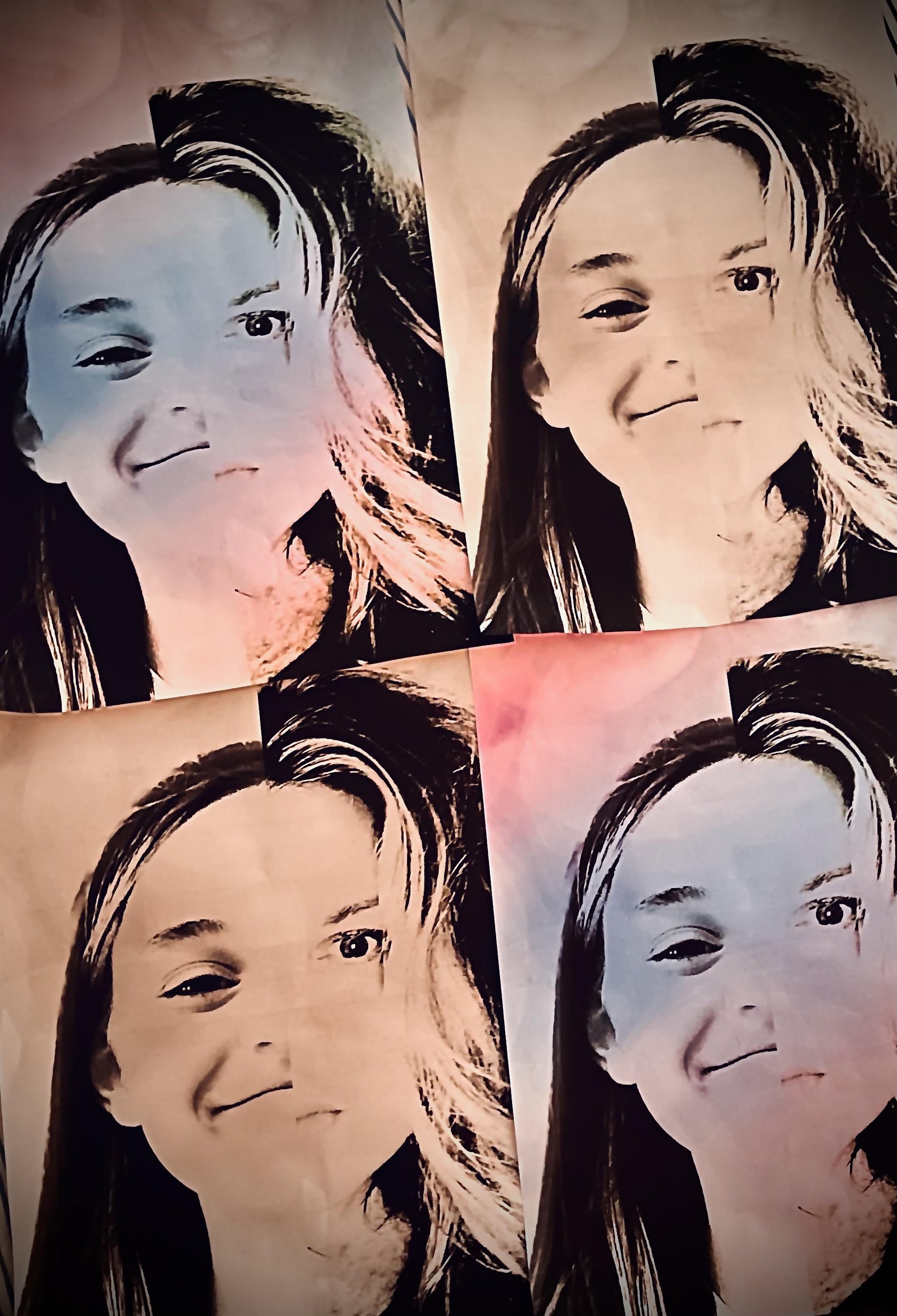
Don’t look back inspired Ruby and me to see ourselves within the divided face. Young and old, fearless and fearful. The movement in the piece helped us connect with similarities and differences. We started with photography; we each took a digital photo and then chose two older photos from 7 yrs ago to layer in the background. Using my limited photoshop ability, our heads didn’t completely sync, and that was ok. It was about the speed of growth and facial expressions given ages and stages. We then layered cotton candy-coloured clouds over 2 of the frames and sepia tones over the other 2. The pop-art feel reflected the recent Warhol exhibit at the AGO. The intention was to try and paint/ collage over the top, but that was a bit ambitious, and we took too long in our response.

My partners’ piece made me think of silkscreens, and pop art. Their title also inspired my piece. At the time of creating this piece, many things I was reading and experiencing were speaking of spaces “in between”, betwixt and between spaces. So, I took a pause myself and incorporated the dots of vintage comic books in my work while thinking of remote control.
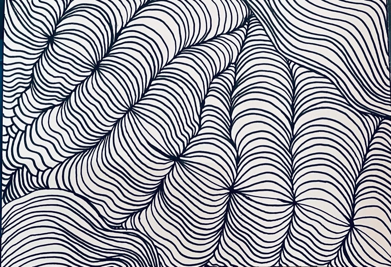
Roobs initially thought the space between was a portrait of Lola from Charlie & Lola books & the Brit cartoon series. She also said if you stare at the dots everything starts to move and fills the spaces. She sat down with a marker and music on mixed media paper and just let it all flow. From rolling hills to brain waves she kept filling space.
The flow and movement of my partners’ piece made me think of water. The lines of her work have a lot of movement, so I reimagined them as waves. No wave ever crashes the same. Watching water is very peaceful for me, and as I live near the Detroit River where it flows into Lake Erie, I was inspired to create a landscape piece.


This takes inspiration from your beautiful landscape piece Shift and the feeling of being barefoot in the sand or dirt or on a bed of pine needles – grounding
I often collect bits of nature, and you can tell in some of these the paint is still wet
We flattened the birch bark and dried it; little pieces turned into the artwork – rooted – 3 is more potent than one or two when intertwined as roots together
Acrylic on birch bark ….
Rooted in my relationship P+D
Rooted in nature – we love camping
Rooted in self-awareness to try new things … such as painting ☺️
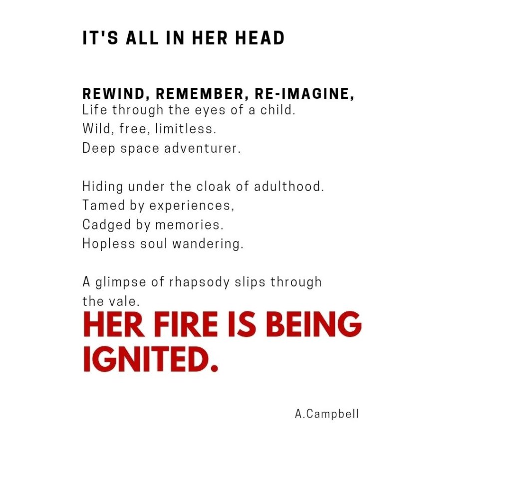
Rhiannon Barry (St.Catharines, ON) & Adele Campbell (London, ON)
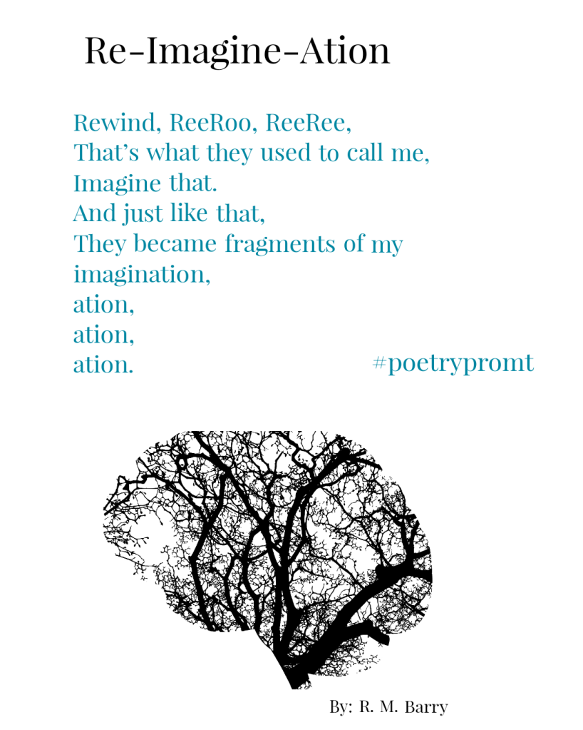
Following the theme closely, I wanted to fit in all three parts of Re-, Imagine and -ation. I began considering Re, and the first thing that popped into my head was all the nicknames I’ve been given over the years and then secondly, a realization that many of them were from high school or given to me by people I’ve known in what seems to be a lifetime ago.
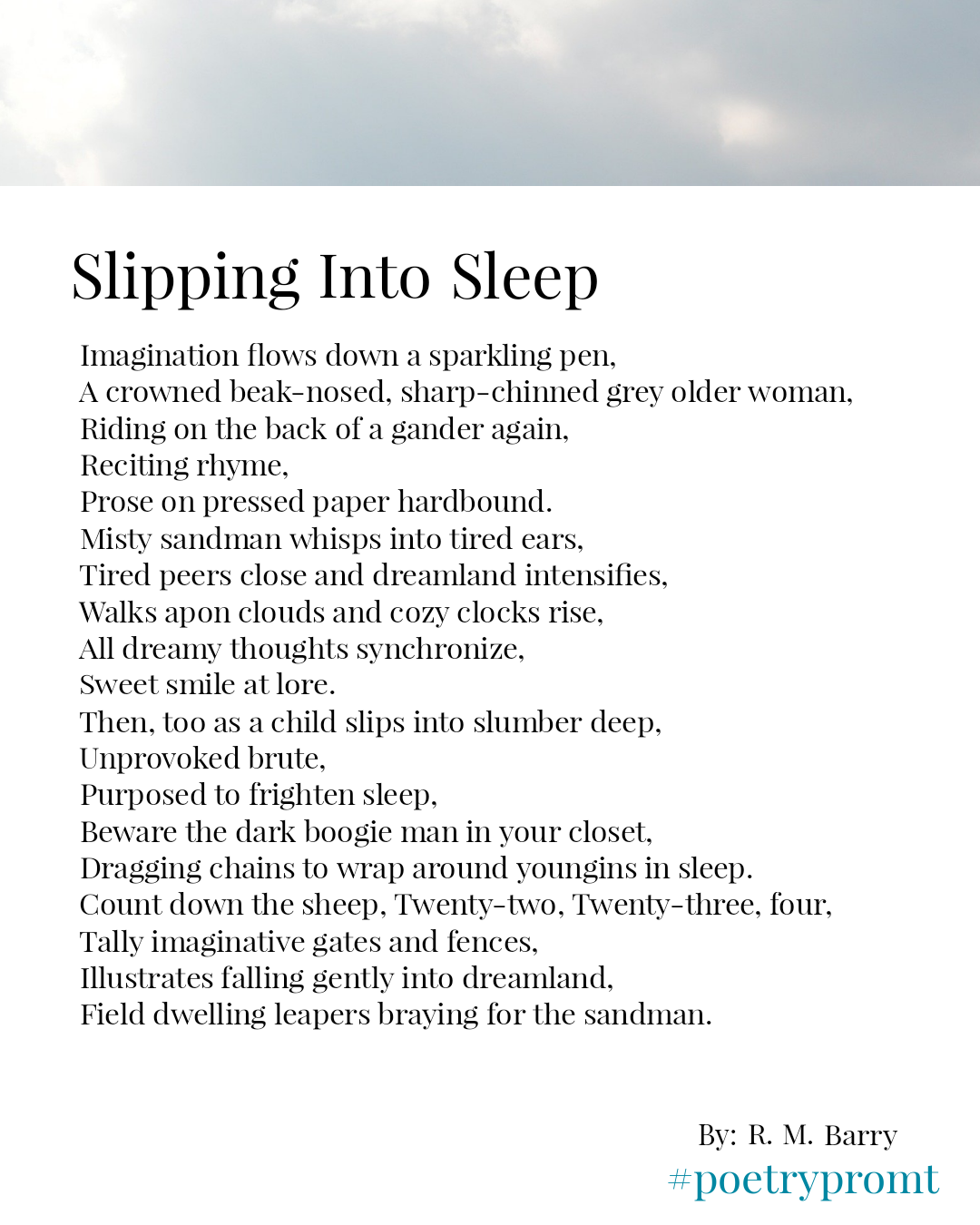
Slipping through the veil prompted me to consider slipping into dreamland and all the childhood characters who live
in that dreamy space; Mothergoose, the sandman, the boogie man and sheep.
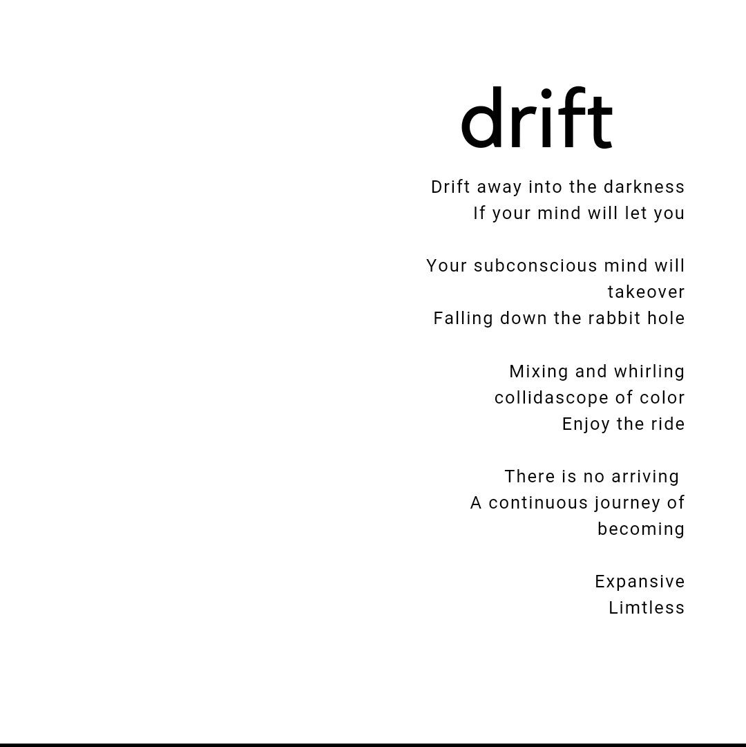
I was provoked to write about when those disturbing things you try to push out of your mind seem to pop up during meditation, letting you know you have more healing to do.
Tinamarie Jones, (St.Catharines, ON) & Debbie Summers (St.Catharines, Ontario)
Title: Icarus
10×12 Acrylic on cardboard
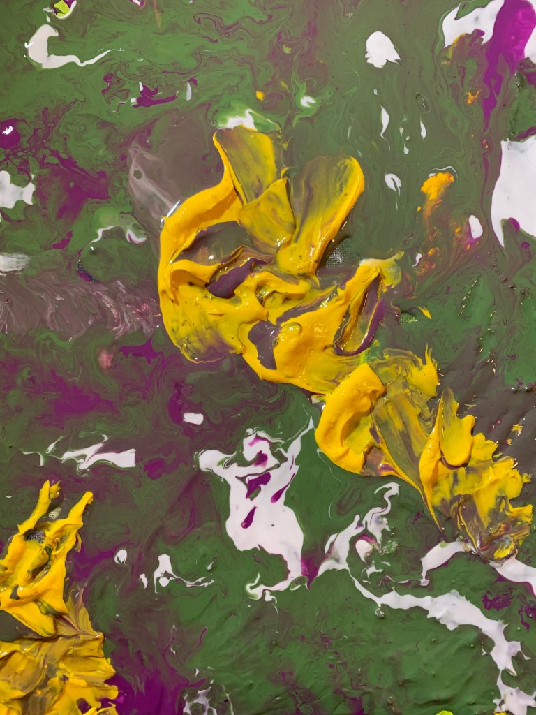
Given the ‘re-imagination theme, I decided to reimagine one of my earlier works. The original piece had a lot of texture, so I used a flow medium over the top to layer over colour on top of the surface and modified the palette of the original piece. I then used a palette knife to add some solid yellow colour and texture, as the yellow in the initial underpainting was very muted, and this brought it forth and reimagined it more robustly.
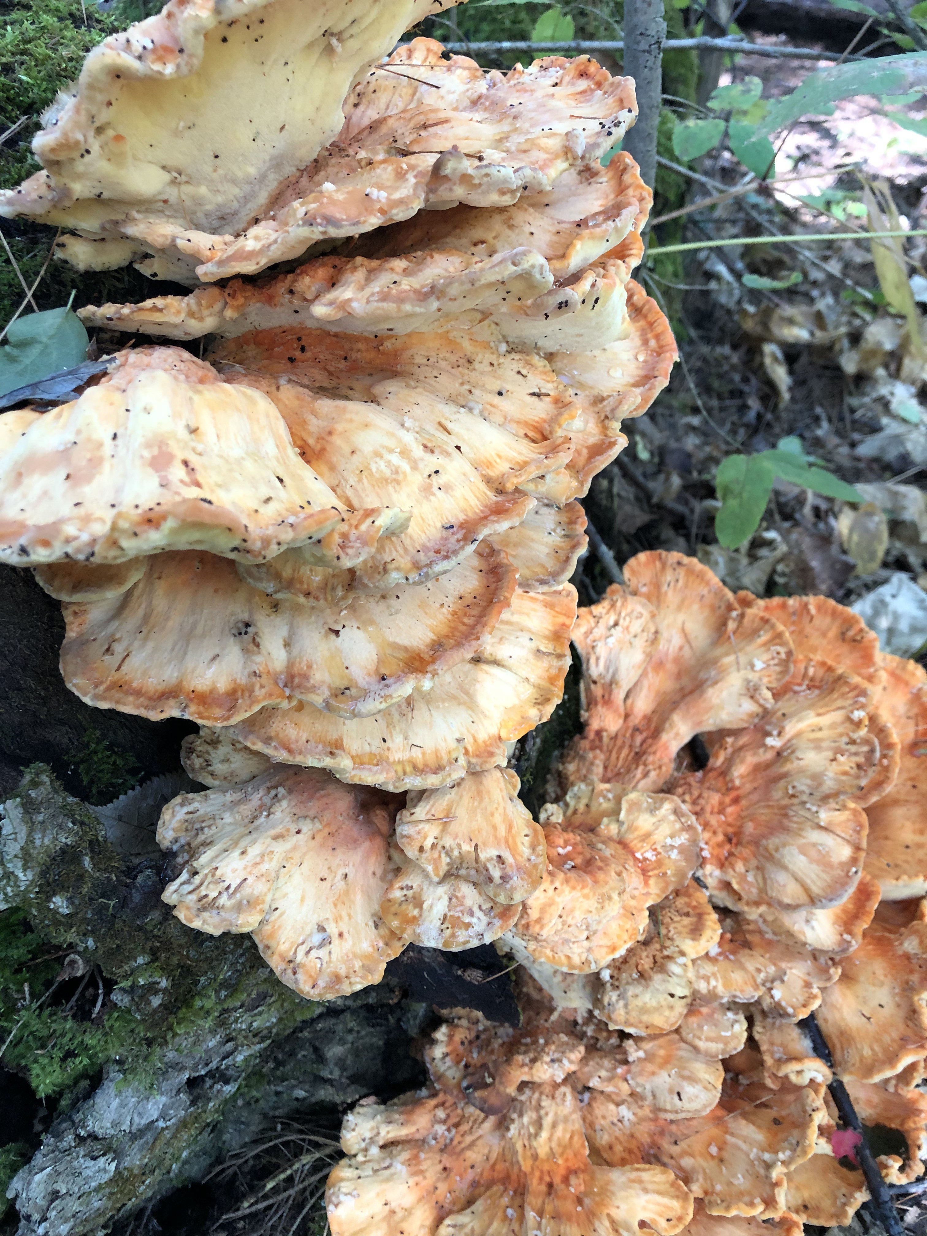
Title: A Natural Wonder in the Woods
Photograph
Keeping the reimagining in mind, when these are healthy, they can forage, be cleaned and cooked – they taste like chicken! These mushrooms are called ‘chicken of the woods.’ But these are currently being used as new homes for bugs (mushrooms reimagined as homes). They will feed on them this season and will likely regrow next year. Nature is fantastic and is the true teacher of re-imagine.
I loved the use of colour in your first piece and found the shades of yellow and orange a fitting response to your original conversation starter.
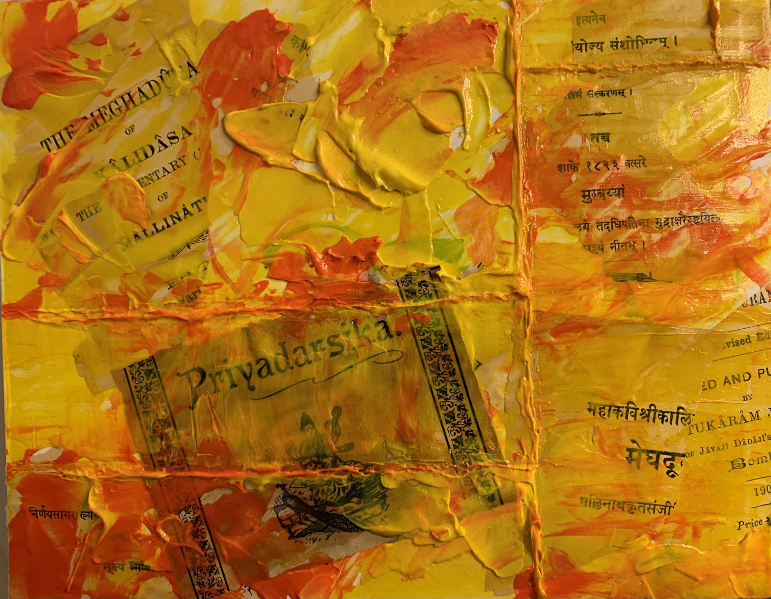
Title: Agnidhuta – The Fire Messenger
8×10 acrylic, gouache and antique paper on birch board
Debbie’s piece made me think of clouds and thinking of clouds made me think of the Sanskrit play Meghaduta or The Cloud Messenger. I enjoyed the subtle colouring in Debbie’s piece and decided to take inspiration from her palette and go for much stronger colours in my work. Debbie’s article was also beautifully organic, and I decided to riff off that and create something very non-organic where the music is very manipulated. A theme of purifying fire, of transformation, underlies the work.
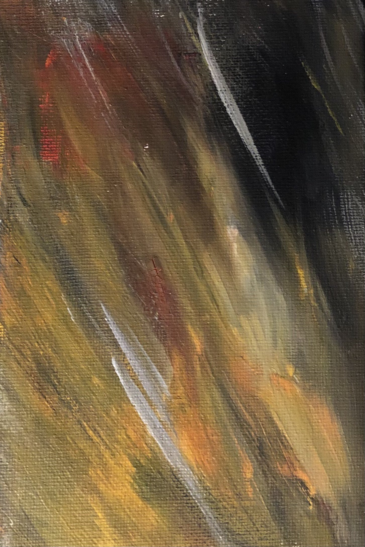
Title: Shadows Beyond the Fire
6” x 8” acrylic on canvas
I loved the history and meaning behind Tinamarie’s piece.
I took my inspection from the colours, the transformation and the translation ‘fire messenger’ literally.
Reflecting on fire, I recognized that fire could be tragic and painful and beautiful, mesmerizing and purifying. As you look within, some shadows may always haunt, but the flame can always burn brighter.
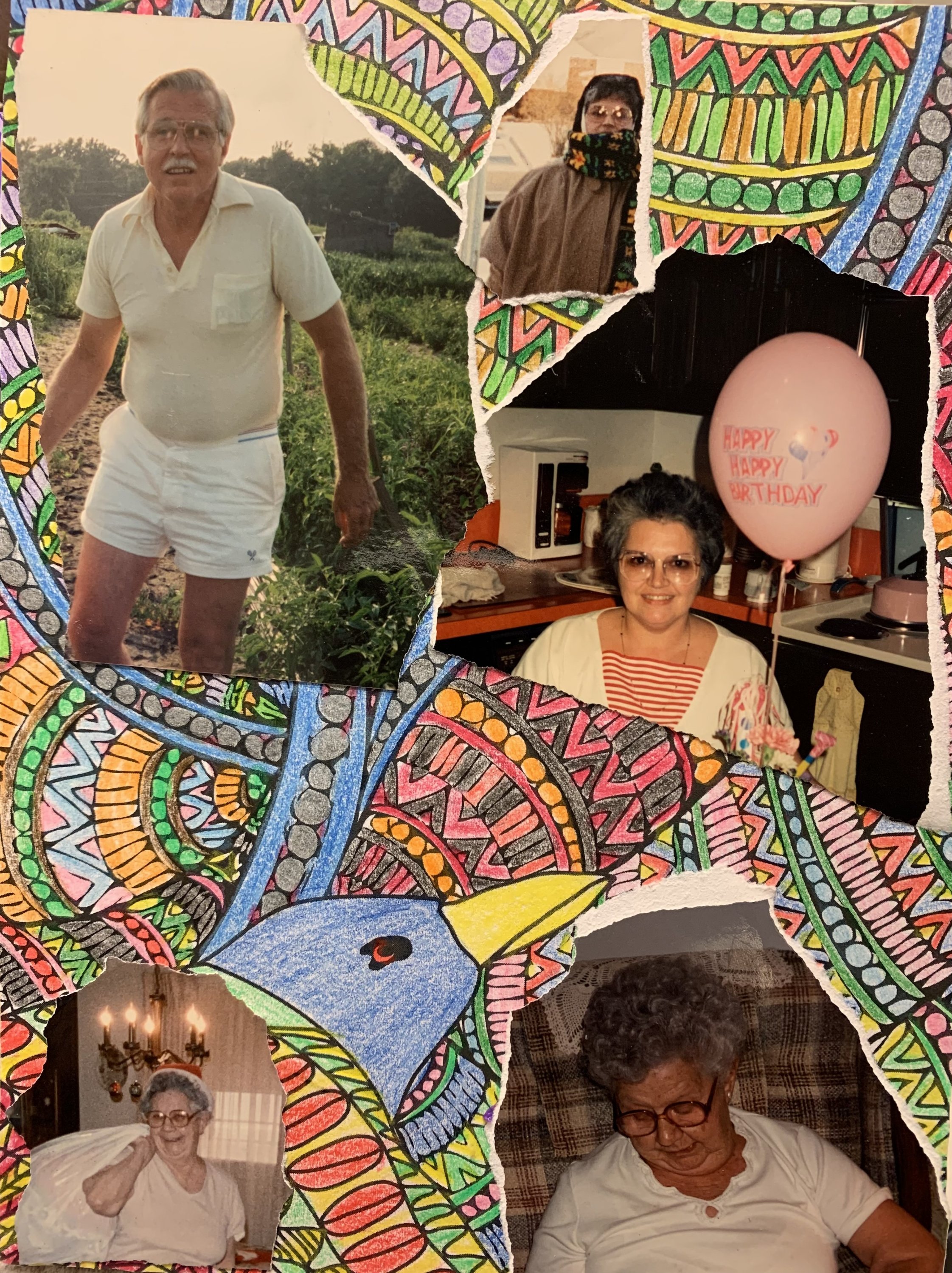
Title: La Fenice (The Phoenix)
6×8 Paper, pen, coloured pencil and photographs on birch board.
Debbie’s beautiful piece made me reflect more deeply on the nature of transformation. Fire can harm but purify and clarify as well. The image shows my mother, grandmother, and uncle, all of whom have passed. My mother and uncle died in 2019, 6 days apart, and I’m still coming to terms with it. My mother loved to colour and had a lovely sense of colour and design. I’ve used one of her pieces as the background and arranged the images over the top, with the bird visible lower left. In my final piece, I imagine a joyous, colourful rebirth with the phoenix once again bringing them to life.
Title: vibrant, Free, Floating
16” x 20” Canvas – Mixed Media
Talking of fire, rebirth, clarifying t made me think of the other elements; water, land and wind. The base is a paint pour I did years ago, which always reminded me of these elements.
The colours in Tinamarie’s piece reminded me of air balloons; vibrant, accessible and floating.
Your reflection on those you have lost, your fond memories and knowing they are with you leaned me to those more religious than I that our lost loved ones are always watching over us from above.
I re-imagined all that reflection as watching air balloons floating in the sky from above—a different perspective than looking up at them.
The representation of the air balloons are cuts of travel magazines of places I would like to visit and sites I would like to see.
April Garrison, (St.Catharines, ON) & Rhiannon Barry (St.Catharines, Ontario)
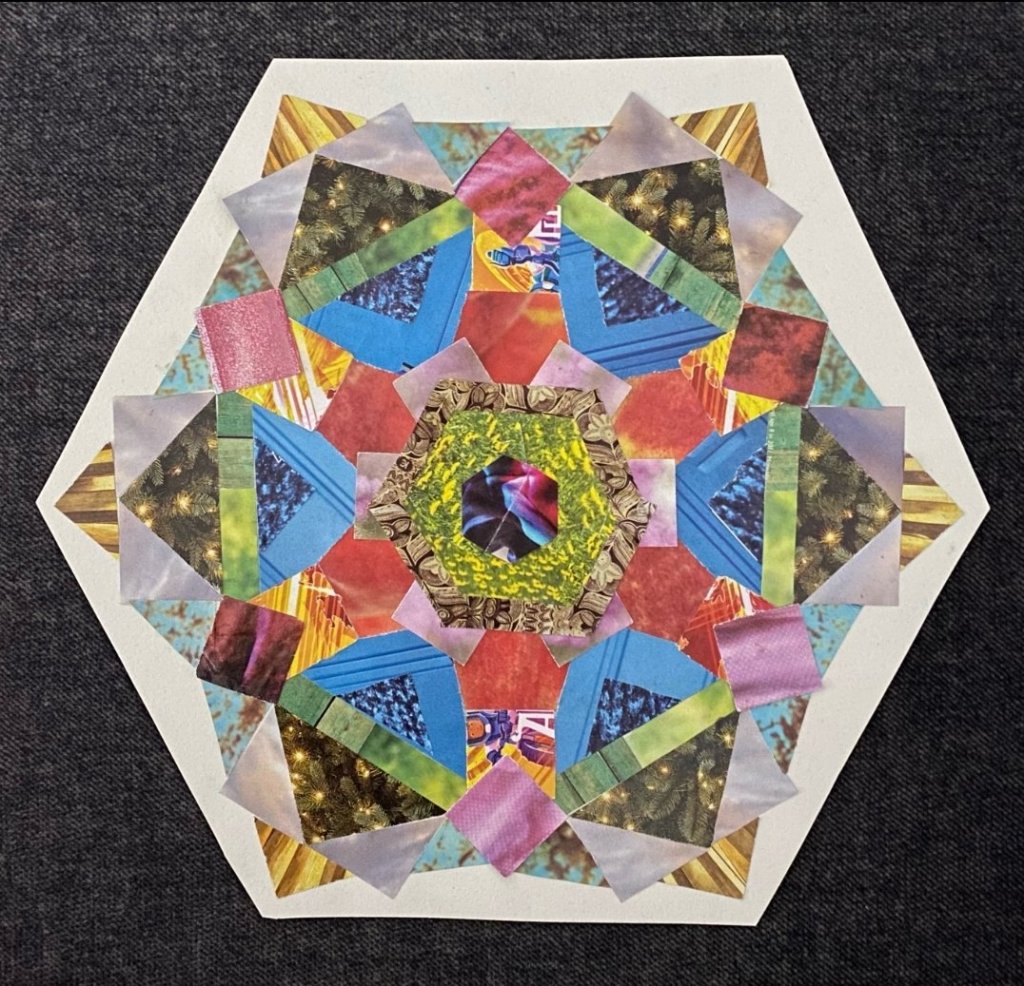
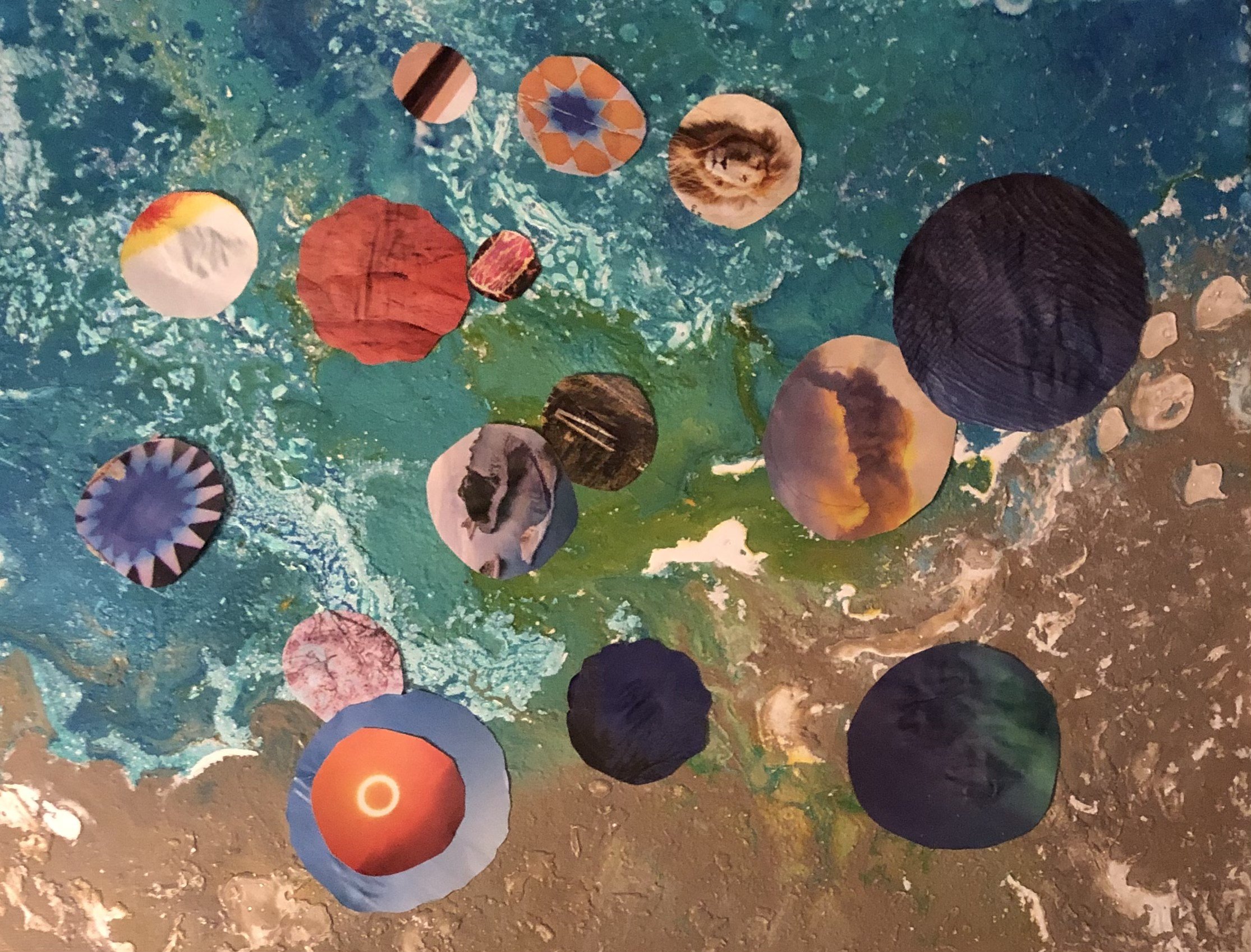
My inspiration was a kaleidoscope. When you “reimagine,” it’s a way of looking and perceiving things differently, like how it is when you look through a kaleidoscope. Also, “reimagine” has a dreamy feel to it, and I find it mesmerizing watching kaleidoscopes move. This doesn’t impact, but I feel like your mind does as you explore all of the colours and designs in this piece. It inspires new ideas, evokes memories and allows your mind to wander… inviting you into re-imagination. 🙂
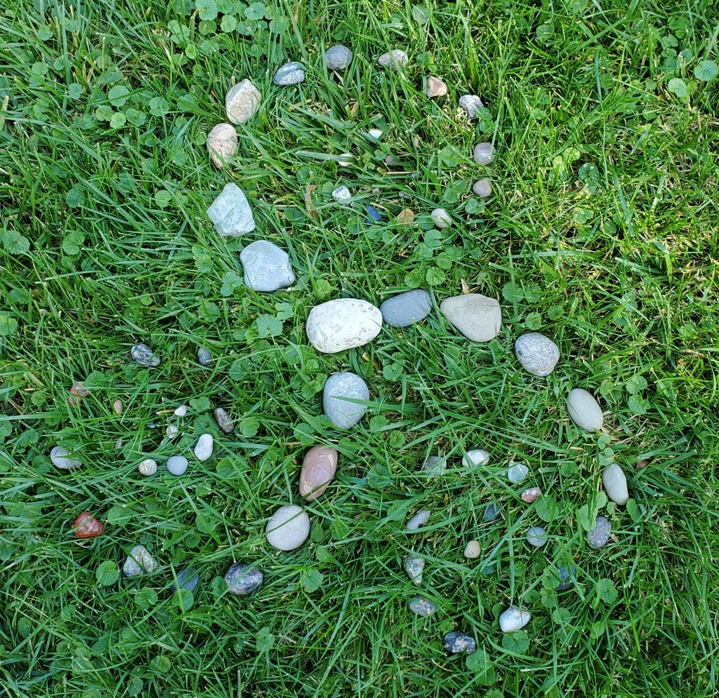
It’s the product of a morning meditation practice—your kaleidoscope inspired me to incorporate ancient geometry into my usual mediation practice of stone stacking.
Usually, I take advantage of a beach environment and spend time ankle-deep in the gentle waves gathering stones before spending an hour or more stacking nine high…it takes a lot of concentration and balance.
Today I was not at the beach, but I had some of my combed rocks here and a beautiful green lawn. I noticed how the grass bent and sprang with each strategic drop.
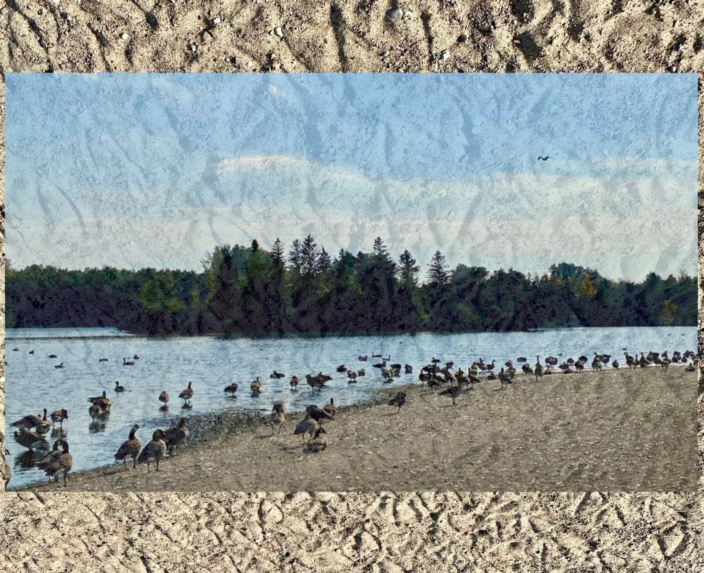
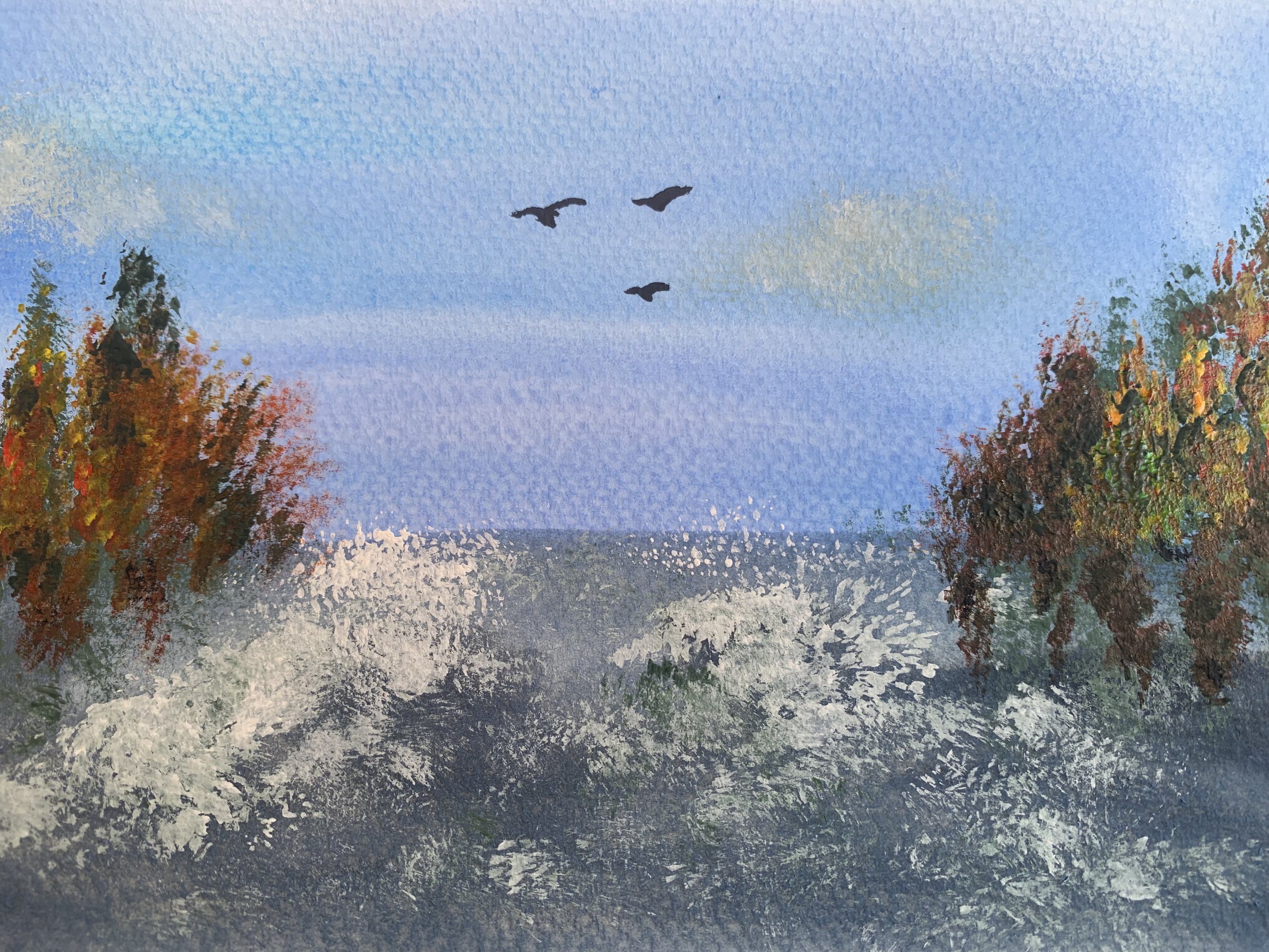
I’m camping in the trailer this weekend. I’ve been taking a bunch of photos of all the pretty fall colours up here. I had one I was going to send, but then we went to the beach. It was incredible to see all of the Canadian Geese gathered together. I layered my photos on top of each other to heighten the experience of so many of them. The bottom picture is the sand after being trampled by so many webbed feet! It made such a great pattern, somewhat geometric feeling, which reminded me of our exchange.
The last piece reminded me of a miniature painting I made earlier last year so I found it and I uploaded it into animation software, and then created some movement and added effects with a freezing tool.
I’ve been putting some of my other paintings through this app. I love messing around with the features and would love to animate all my favourite pieces and do an immersive experience exhibit with projectors one day.
I kept coming back to this video clip from my last camping trip. What fascinated me most about your last piece was the white squiggly lines that moved. Similarly, the lines of white-grey smoke in this video take that shape.
View the Timelapse video of this creation: https://youtube.com/shorts/JP8z47fS4PU?feature=share 6-R. Barry-Clouds Like Cotton Candy-$260 +shipping
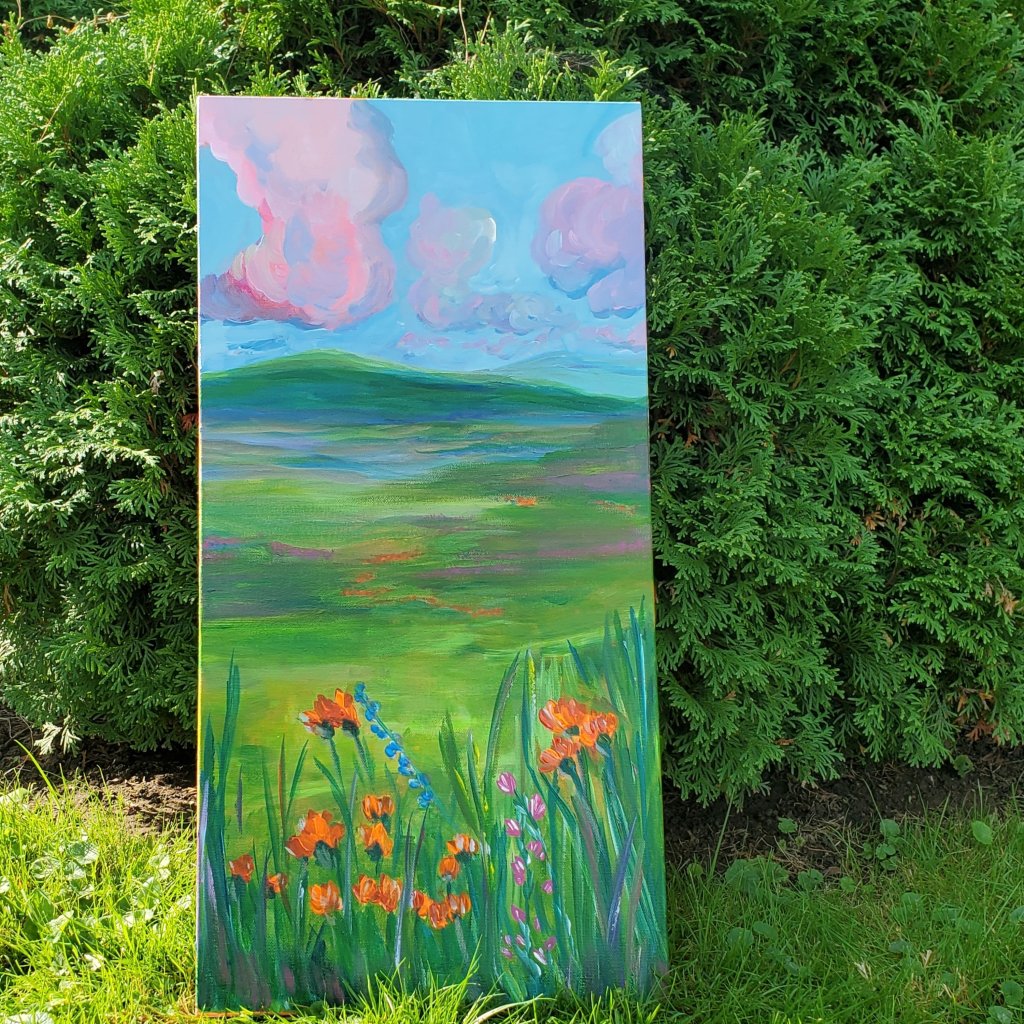
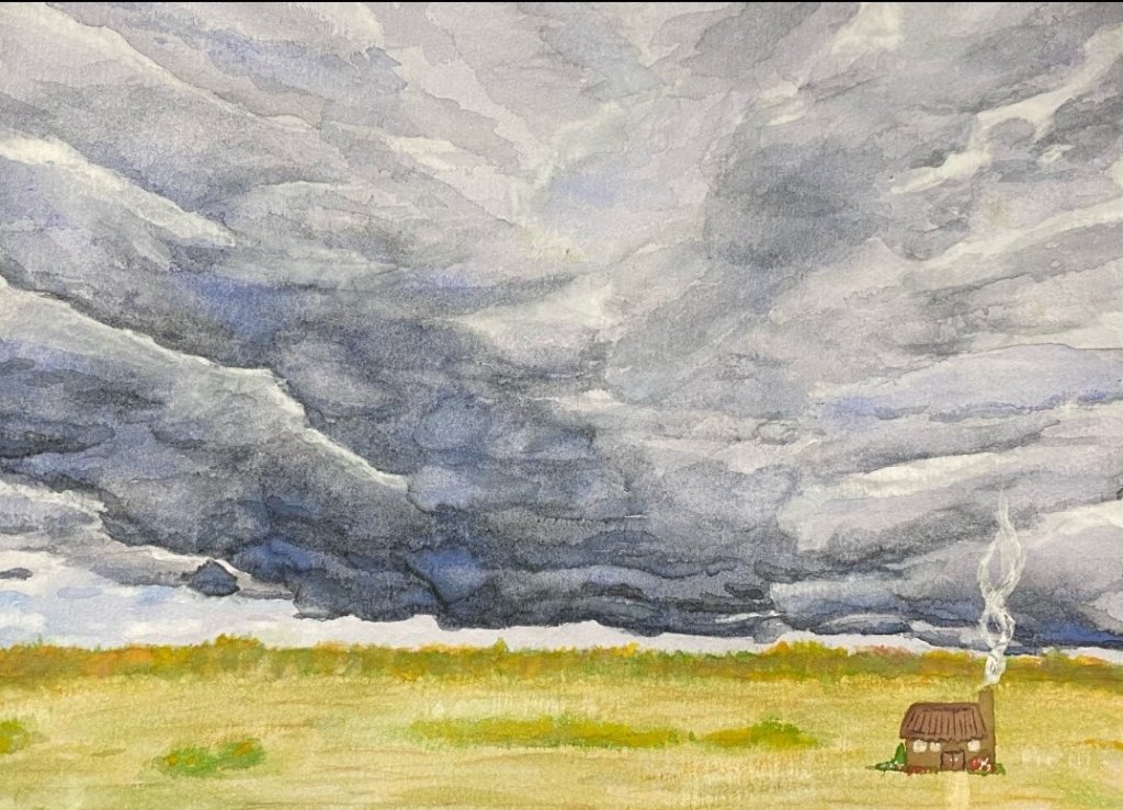
I thought, ‘How artsy’! I loved this response. It reminded me of cozy autumn chats with good friends around a fire. I spent a lot of time growing up on our property, where there was a field across from our firepit that would appear orange when the devil’s paintbrush was out. The orange inspired me. I hadn’t used an orange underpainting in a long time, so I cracked out the orange paint for this one. Click the link to view the timelapse painting videos.

I stepped away from our outdoor Thanksgiving meal last night to capture the sunset. It drew me in with the stunning clouds and harvest orange sky. I snapped a ton of photos.
https://youtube.com/shorts/BSxjFaRzSvM?feature=share
8-R.Barry-Wild Flowers For Days-$260 + shipping
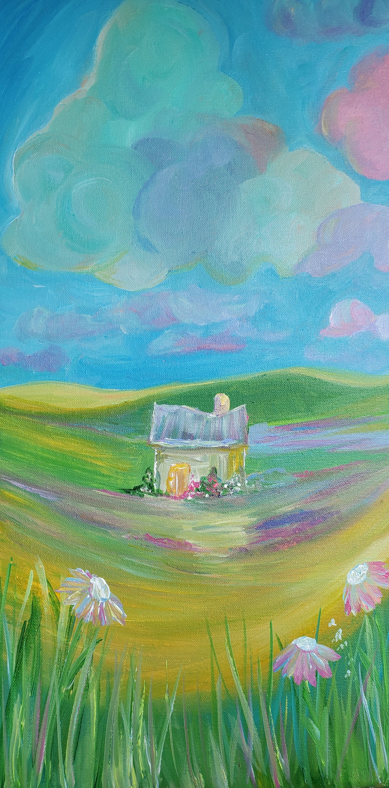
Again with the orange! How autumn. I loved this picture and was inspired to do another orange underpainting again. I kept the little shack in but made it a pleasant home in a flowery field.
Did you enjoy the experience? Please donate to the project:
Help support the continued delivery of this project! Donate
All images and content remain the property of the creators/owners and are not available for copying or publishing without proper prior consent in writing.
